Brand
![]()
BRAND
Hello, style enthusiasts! Well, let’s begin our introduction, where I will immerse you in the central nervous system of the brand and tell you about the strategic decisions and ideas of the brand that were made in the past, as well as its direction and overall vision. I will try to keep everything brief, and I am confident that I will capture your interest. However, it is important to understand that this section of the website is more intended for those who are interested in the design process and the inner workings of Scissor Hands™.
more os a slang: Hey there, style mavens! Let’s kick off our intro where I’ll dive deep into the brand’s nerve center and spill the tea on past strategic moves and ideas, as well as where we’re headed and our overall vibe. I’ll keep it short and sweet, and I bet you’ll be hooked. But heads up, this part of the site is mainly for those who geek out over the design process and the behind-the-scenes action at Scissor Hands™.
ІDЕA
And we’ll start our story with how the idea for the brand came about. Why is the brand called Scissor Hands, why is the primary color pink, and why are there so many skulls? To understand this, we need to go back to 2014, in Kremenchuk, Ukraine. After spending two and a half years in the government sector and understanding its structure, I lost my fear of starting my own business (though I didn’t know what it would be yet). With a year’s worth of savings, I made a tough decision and took a leap into the unknown. The goal was to learn a new craft within a year. Times were tough: President Yanukovych had been ousted, the exchange rate had skyrocketed, and people were struggling. But it was during this period that a classmate of mine found me and said, “I’ll teach you design.” It was a gift from fate! I love gaming and all things digital art, and after risking everything, luck finally smiled on me.
In the process, I realized the workload was immense, almost impossible, but I decided to continue. Then a fateful event occurred: the release of the movie “Fury” with Brad Pitt, who had the perfect undercut hairstyle. I wanted the same look (everyone had it back then), and coincidentally, my classmate had that haircut. I asked, “What gel do I need to get this hairstyle?” He replied, “What gel? Everyone uses wax now.” And so it began. We bought wax from Axe (yes, they made styling products, and they were pretty good). It was cheap, we used it all up, and it was time to look good again. But by then, the dollar had risen significantly (it was now 2015), and no one was importing that wax anymore. We had to find an alternative.
That’s when I discovered the German brand “Schmiere.” It hit me right in the heart. Big, stylish tin, great design, this culture started to absorb me. But at that time, it was insanely expensive for me, as the dollar’s rise was strongly felt, and resources were limited. I began looking for a local alternative and found one. It looked terrible and wasn’t worth the money. But diving deeper into this culture, I started watching YouTube videos showing how to make basic formulas. I decided to save money (we know creativity loves frugality) and went to the market for the four necessary components. I thought, “I’m a designer, I have free time, I know how the country’s internal system works, and I have only one competitor in the market. The market is open, and there’s a window of opportunity, so why not launch my own brand? There won’t be another chance.” And that was the tipping point.
NAME
As the saying goes, “As You Name the Boat, so Shall it Float,” so I had to approach the naming process with utmost seriousness. In 2015, it was trendy to name brands after animals or something brutal, reminiscent of 80s rock bands. Various names came to mind, with the most promising being “Golden Wolf” (inspired by a studio that did animations and bore that name) and “Trouble Shooter.” The latter was the most promising, but it just didn’t click for me.
After two months of searching, I was sitting relaxed, thinking about what to watch that evening. The thought of picking a Tim Burton movie came to me, and then the image of Edward Scissorhands appeared. I immediately realized that the name could be tied to a brand focused on hair and beard styling. The idea was definitely suitable for 2015. Next, I had to check if the name was available for men’s cosmetics. It’s important to understand that you can register two identical trademarks by name, provided they are in different fields of activity and have different logos and fonts, and a trademark needs to be registered separately in each country.
And then came another stroke of luck: the name was completely free in the domestic market, and internationally, no one was using it for men’s cosmetics.
LOGOTYPE
The modern two-faced logo emerged in 2018. It all started with updating our hair product lines, where we wanted to move away from the aggressive skull designs and shift to more neutral human characters, relegating the old designs to collectible magnets.
The first challenge we faced was the heavy workload of our designer, DVicente, who was tied up with other projects. As a result, rebranding just 9 hair product designs took about a year, and we lacked the resources to continue. To understand why we were short on resources for some images, it’s important to grasp our economic situation. In 2018, we were cut off from all economic unions, and men’s cosmetics in Ukraine were popular only within a very narrow audience. Our prices were too high for Belarus, Turkey wasn’t into this niche, and Europe was closed off due to us not being in the Eurozone, meaning every shipment had to be cleared through customs. Russia had closed its borders, requiring customs clearance as well.
I believed the issue wasn’t just customs but the need to continually elevate the product in all aspects. If we fast forward a bit, the decisions I made in 2018 really paid off by 2023, showcasing a long-term strategy.
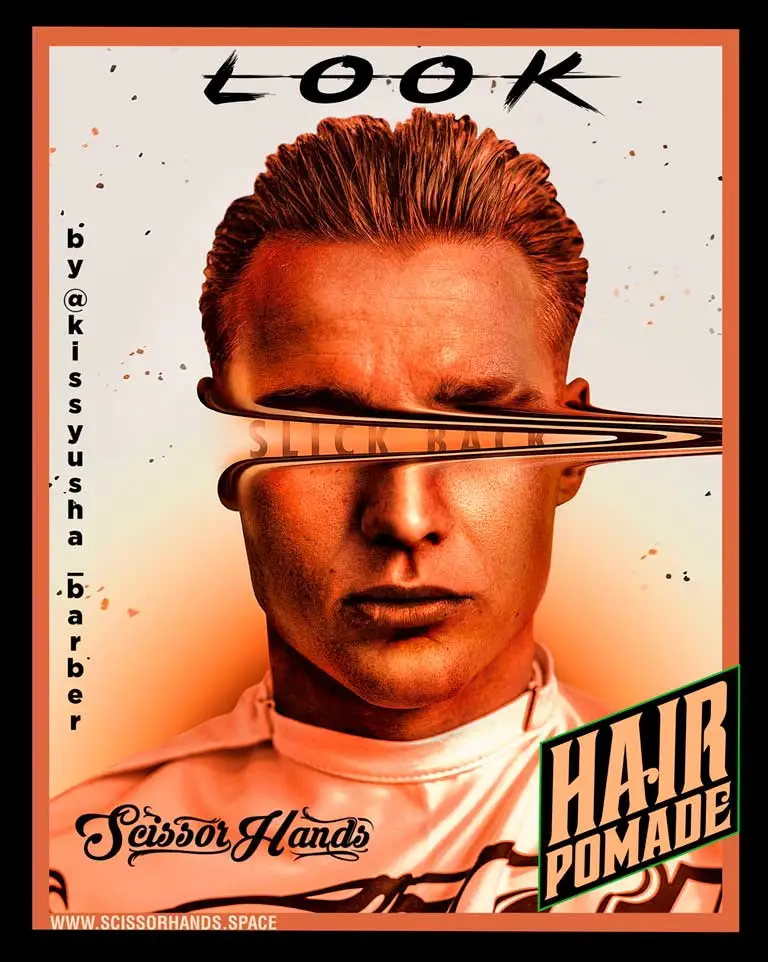
So, we focused on the hair products, and when it came to the logo, I looked at what we had so far and saw a concept where the beard was full of skulls, and the hair featured faces. Considering our national trait of humor, the conclusion was clear: it was a two-faced Devil Joker.
In conclusion, I’d say that the logo and the font of any brand need to evolve and optimize over time. Nowadays, we strive to assign an original font to all new products and add an optimized logo element – a spade with a skull.
COLOR
When choosing a color, you need to understand which market you are targeting – domestic or international. If you’re only focusing on the domestic market, the color of your brand doesn’t matter much (usually it’s black), but the international stage changes everything. If you want to be a big brand, you need to act like one. Choosing the right color was challenging; I didn’t realize how crucial it was until I deeply analyzed all the top global brands in our market segment and found out that you cannot duplicate what others have done.
Every top brand had its unique color and logo text placement. Some had it on the top of a round tin, some in the center, some at the bottom; some logos were straight, some wavy, but none overlapped or encroached on another’s territory. I discovered that red was taken by Australia, blue and orange by the UK, green by Spain, brown by the US, black by Germany, and beige by the Netherlands.
As you can see, the choices were limited, and we ended up with pink. It’s a complex color, especially since we make products for men, which made the task even more challenging. We had to build the entire advertising campaign around the pink color. Working with color is difficult, which is why many brands in the domestic market choose black.
STRUCTURE
If you’re creating a design, it needs to be supported by animation or an impressive poster with a deep concept, or better yet, a solid long-term advertising campaign. Otherwise, the key distinctive features of your design will simply be stolen by other newcomers in the domestic market who will think that you’re just a fluke, while they believe they are the real deal (I have fallen into this trap myself; it’s a level you just have to pass through and move beyond).
So, what’s our structure? It consists of four key elements: a circle, a parallelogram, and an internal and external star.
The foundation of our brand’s idea is the planet GreasLand (circle), which is dedicated solely to one goal – living and building barber culture. Everything stems from this.
The second element is the inner star (a term from the Illustrator program). Like any culture, it must expand and export itself not only beyond its planet but beyond its universe. Therefore, the brightest representative travels through the star portal (inner star) to conquer the Milky Way.
The third element is the parallelogram (technical education came in handy after all), symbolizing movement, which is essential for creating good hair styling.
The fourth element is the outer star, representing that we will work in all directions, namely hair, beard, and body.
TOTAL
Everything developed dynamically, continuously modernized in stages based on gathered insights, and shaped by my physical and financial limitations. Once all preparations were in place, we geared up for the pivotal phase. As you can imagine, I had a plethora of ideas, yet one must face reality. Sometimes, ideas spark brilliantly in the mind only to fade away. It’s akin to natural selection in the real world: survival favors the strongest, the adaptable, or those who patiently await their moment. A grand and dazzling idea doesn’t always translate into guaranteed success.
Author of the article:
Nazar Eduardovych Zinenko,
CEO of Scissor Hands™
Editor:
Kurylo Svitlana Pavlivna
ПРОДОЛЖИТЬ ЧТЕНИЕ
ПРОДОВЖИТИ ЧИТАННЯ
CONTINUE READING